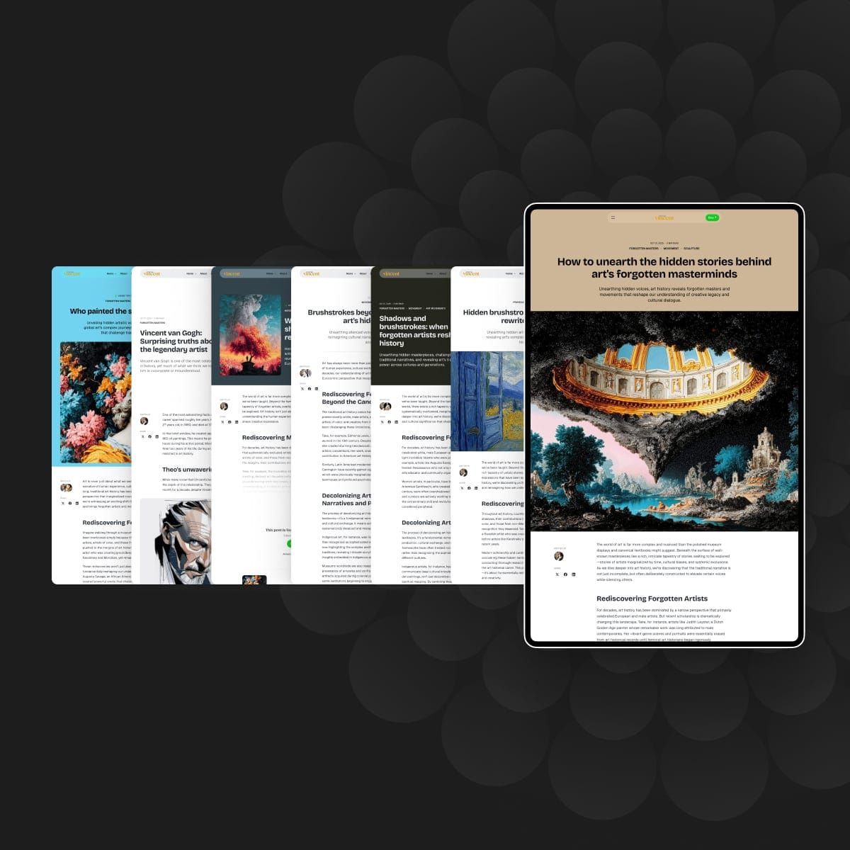
Vincent Style Guide
Explore all the styling capabilities of this Ghost theme with comprehensive examples of typography, blocks, and design elements

Typography
This theme includes beautifully styled heading levels from H1 to H6, helping you create clear content hierarchy and improve both readability and SEO. Each heading level has distinct typography and spacing to guide your readers through your content.
Heading 1 and heading 2 examplea showing how longer titles wrap to multiple lines
Heading 3 example that shows how section titles look when they're longer
Heading 4 example displaying how subsection headings appear with extended text
Heading 5 example showing smaller heading styles for detailed content organization
Heading 6
Quotes
You can make quotes stand out with two types of blockquote styles that can be applied directly in the editor.
“Nulla egestas vitae tellus et fringilla. Vestibulum ante ipsum primis in faucibus orci luctus et ultrices posuere cubilia curae; Duis egestas, diam id fermentum vulputate, dolor justo tincidunt urna, quis laoreet sem justo vel urna.”
— Someone, somewhere
And a second style that you can use for larger quotes:
★★★★★
“A computer lets you make more mistakes faster than any other invention with the possible exceptions of handguns & Tequila.”
— Mitch Ratcliffe, veteran technology journalist
⭐︎⭐︎⭐︎⭐︎⭐︎
“A computer lets you make more mistakes faster than any other invention with the possible exceptions of handguns & Tequila.”
— Mitch Ratcliffe, veteran technology journalist
Bookmarks
Bookmark cards transform simple URLs into rich, visual link previews featuring the page title, excerpt, author, publisher, and preview image. This theme displays bookmarks in an elegant card format that encourages clicks while maintaining a professional appearance.
Products
Showcase products, services, or recommendations with elegantly designed product cards. Each card can include an image, description, call-to-action button, and rating—perfect for affiliate links, recommendations, or promoting your own products.
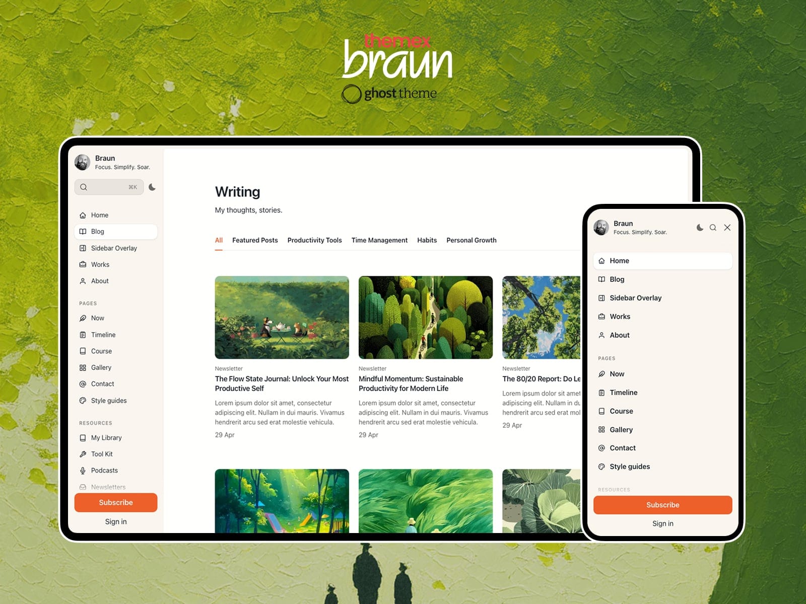
Braun
Braun is the perfect Ghost theme for showcasing your work and captivating your audience. Tailored for designers, developers, and solopreneurs.
Call to action
Drive conversions with strategically placed call-to-action cards. This theme displays CTAs prominently while maintaining visual harmony with your content. Target specific audiences (visitors, free members, or paid members) and choose whether to show them on your website, in newsletters, or both.
Ghost is a powerful app for professional publishers to create, share, and grow a business around their content. It comes with modern tools to build a website, publish content, send newsletters & offer paid subscriptions to members.
Signup cards
Grow your audience with beautifully designed signup forms that integrate seamlessly with Ghost memberships. The theme intelligently displays signup cards only to logged-out visitors, ensuring existing members never see redundant prompts.

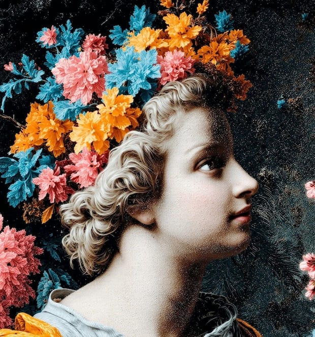
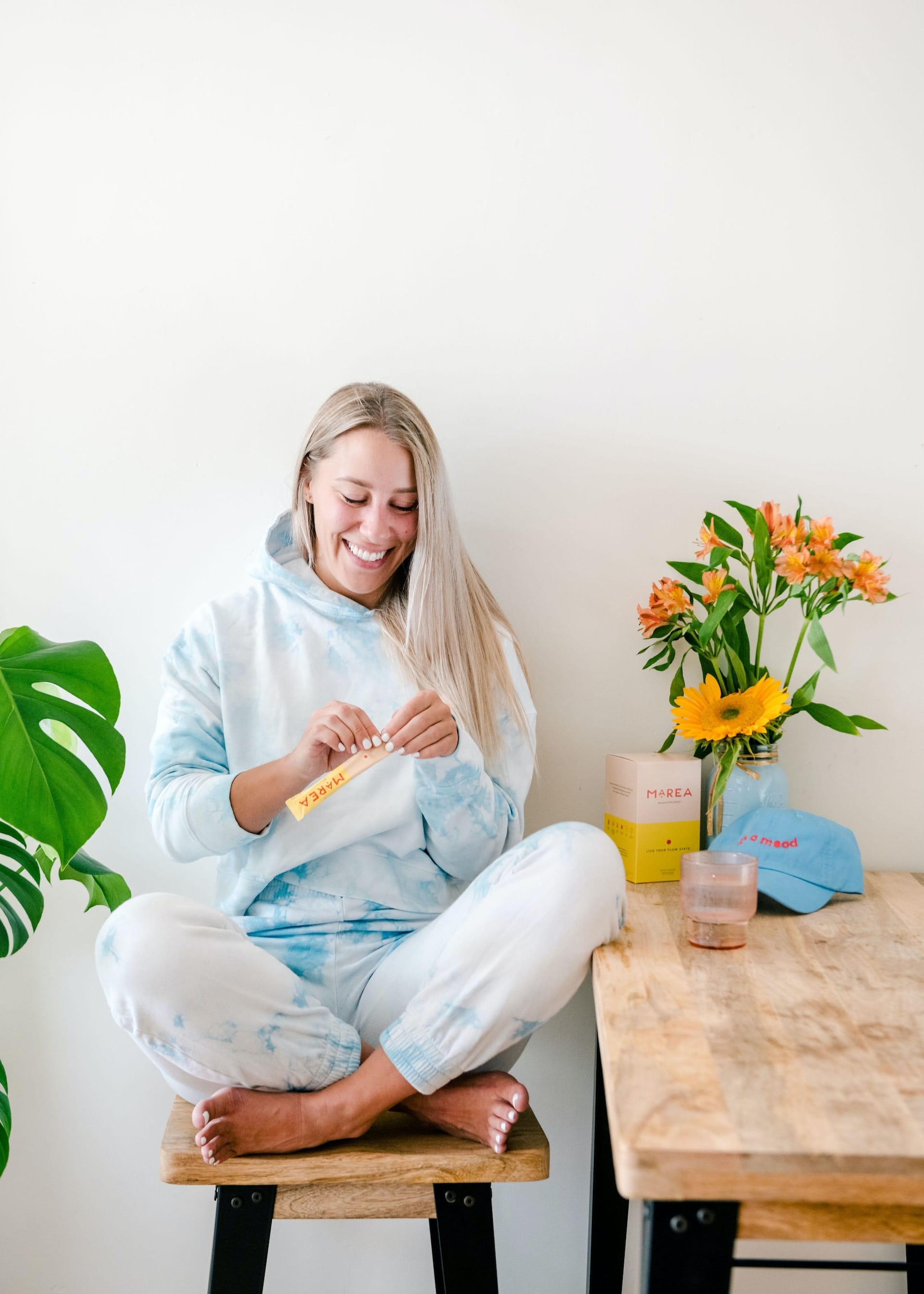
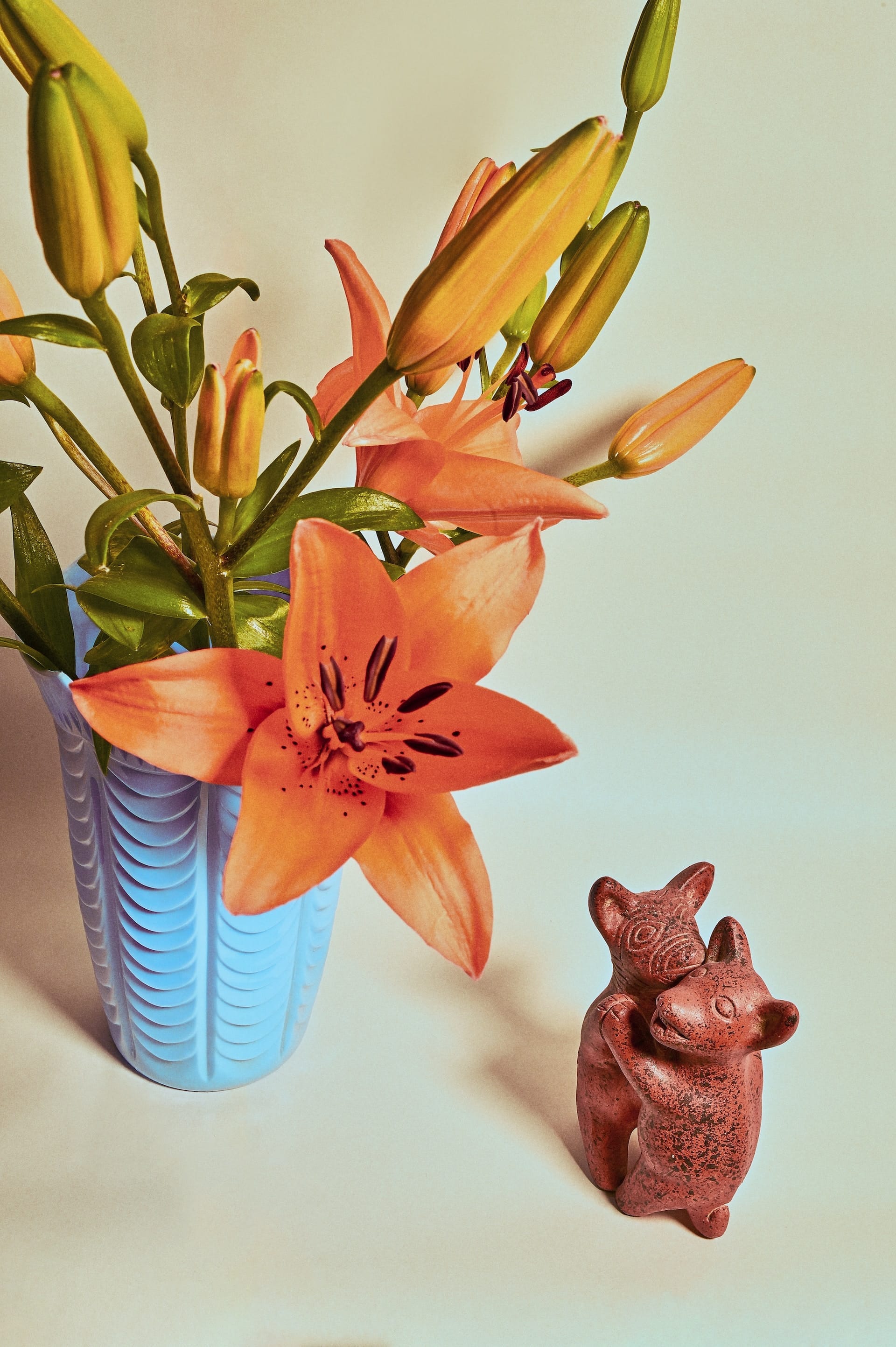
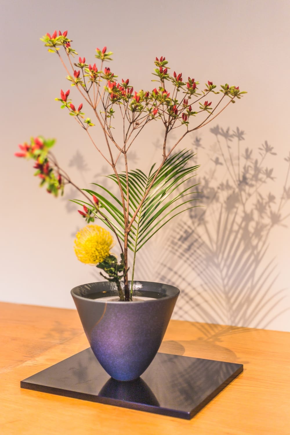
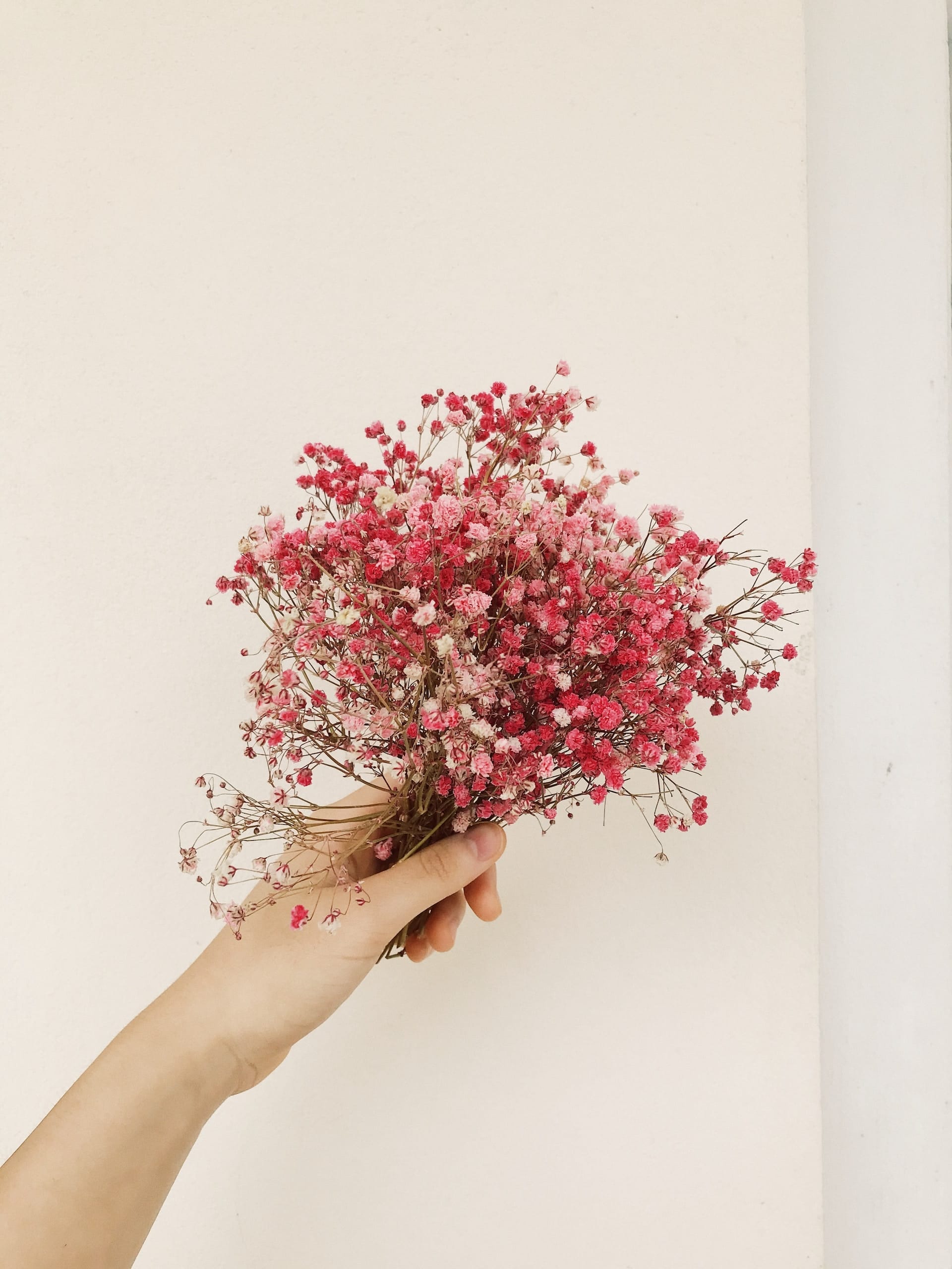
Images
Create visually stunning content with responsive image support in multiple sizes. This theme displays images beautifully at normal, full, and wide widths, each optimized for different storytelling needs. Add captions to provide context and credit photographers or sources.
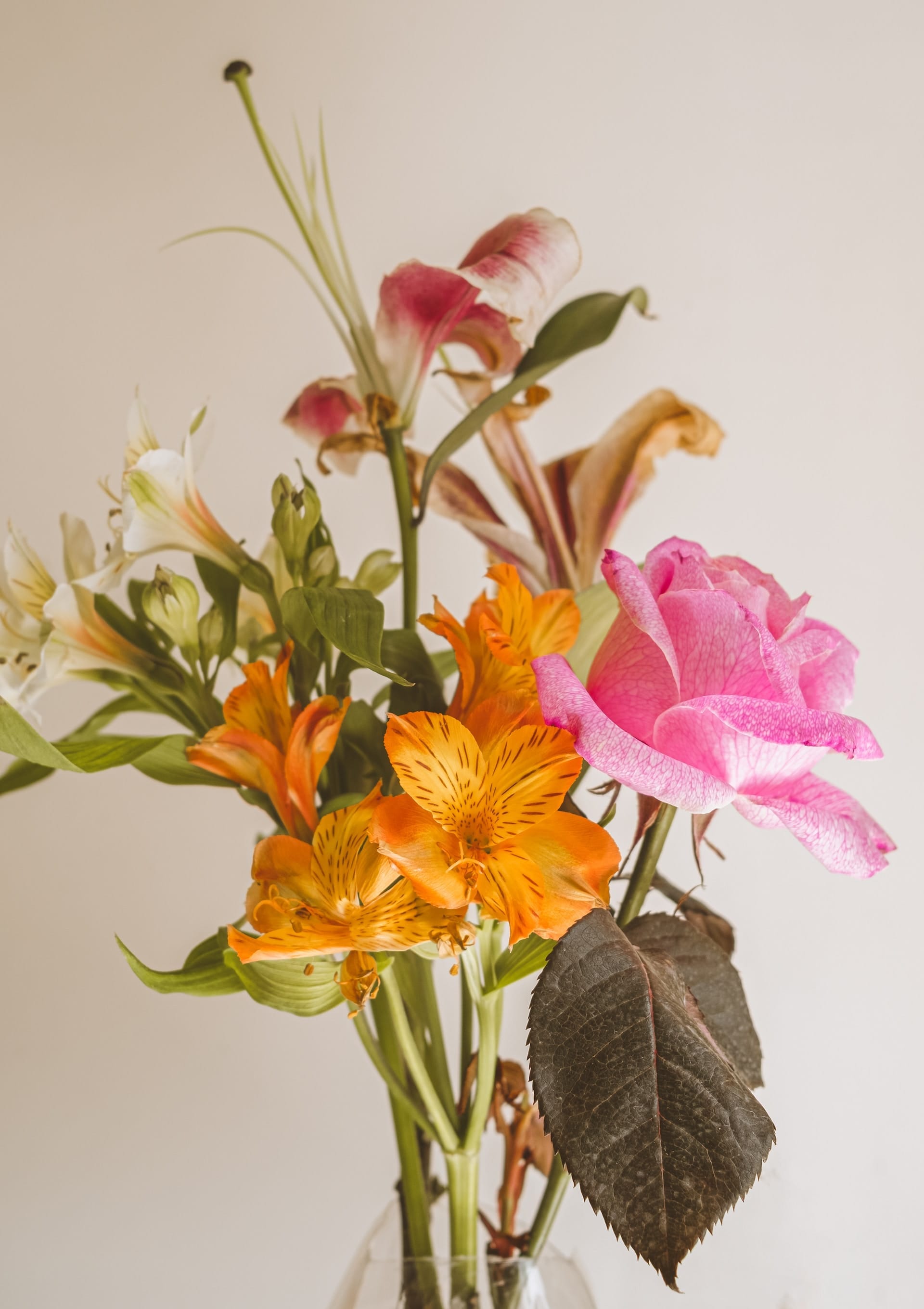
Gallery
Display multiple images together in responsive gallery layouts. This theme supports galleries of up to 9 images, automatically optimizing and organizing them to look perfect on any screen size. Great for portfolios, photo essays, or showcasing multiple angles of a subject.
Video
Embed videos seamlessly from YouTube, Vimeo, and other platforms. This theme displays video embeds with responsive sizing and elegant styling that matches your content design, ensuring a professional viewing experience across all devices.
Embedded
Video by BlinkMyBrain
Native videos
Nam vitae ex erat. Nulla maximus vel mi vel pulvinar. Vestibulum laoreet ultrices lectus, et iaculis risus malesuada a. Fusce et venenatis sem. Nullam ac vehicula urna. Cras et fringilla nunc.
Nam vitae ex erat. Nulla maximus vel mi vel pulvinar. Vestibulum laoreet ultrices lectus, et iaculis risus malesuada a. Fusce et venenatis sem. Nullam ac vehicula urna. Cras et fringilla nunc.
Nam vitae ex erat. Nulla maximus vel mi vel pulvinar. Vestibulum laoreet ultrices lectus, et iaculis risus malesuada a. Fusce et venenatis sem. Nullam ac vehicula urna. Cras et fringilla nunc.
Header cards
Break up long content with impactful section headers. This theme styles header cards as full-width dividers that can include a title, subheading, custom accent colors, background images, and call-to-action buttons—perfect for creating distinct chapters in longer articles.
Preheading
Virtual garden planner
Design your dream garden before lifting a trowel. Our intuitive drag-and-drop interface lets you experiment with different layouts, plant combinations, and color schemes.
Learn more
Eyebrow
Virtual garden planner
Design your dream garden before lifting a trowel. Our intuitive drag-and-drop interface lets you experiment with different layouts, plant combinations, and color schemes.
Learn more
EYEBROW
Send multiple links with one link that others can import
Design your dream garden before lifting a trowel. Our intuitive drag-and-drop interface lets you experiment with different layouts, plant combinations, and color schemes. Visualize how your garden will look throughout the seasons and get plant spacing recommendations for optimal growth. Turn your gardening vision into reality with ease!
Learn more
EYEBROW
Transformative Knowledge with Our Premium Weekly Newsletter
Learn more
Audio
Share podcasts, music, or audio content with an integrated media player that looks beautiful in both posts and email newsletters. Upload audio files directly to your content or embed from platforms like SoundCloud and Spotify.
File
Offer downloadable resources like PDFs, spreadsheets, templates, or any other file type. This theme displays file cards with a custom name and caption, making it easy for readers to understand what they're downloading before they click.
Buttons
Create clear calls-to-action with standalone button cards. This theme supports both center and left-aligned buttons with custom text and URLs—perfect for directing readers to landing pages, signup forms, or external resources.
Toggles
Organize content efficiently with collapsible toggle sections. This theme makes toggles elegant and intuitive, perfect for FAQs, detailed explanations, or any content that benefits from progressive disclosure to avoid overwhelming readers.
Toggles allow you to create collapsible sections of content which is a great way to make your content less overwhelming and easy to navigate. A common example is an FAQ section, where readers can expand only the questions that interest them.
Donec eu gravida ligula non euismod magna in sed elit in ipsum efficitur scelerisque non at mi
Mollis elementum vitae commodo in. Est fames suscipit ut sapien. Vehicula a nam pulvinar nunc tristique quam quis. In erat libero nisl nulla ullamcorper lectus. Rhoncus tincidunt aenean pellentesque egestas hendrerit. Volutpat sit quis donec justo sit ut. Elit a faucibus rutrum fringilla. Molestie lectus sed consectetur faucibus cursus. Mollis gravida sit congue ultrices quam pretium. Sed non auctor ultricies tincidunt in cursus urna in in. Enim euismod consectetur tempus fames amet et auctor. Pretium tincidunt viverra blandit lorem vulputate nibh sociis. Ipsum euismod ac vehicula in diam nec condimentum egestas. Eleifend fames adipiscing donec pellentesque ligula condimentum. Habitant imperdiet in in quisque eu faucibus habitasse quis.
Id iaculis mauris mattis leo cursus mattis?
- Mollis elementum vitae commodo in.
- Est fames suscipit ut sapien.
- Vehicula a nam pulvinar nunc tristique quam quis. In erat libero nisl nulla ullamcorper lectus. Rhoncus tincidunt aenean pellentesque egestas hendrerit.
- Volutpat sit quis donec justo sit ut. Elit a faucibus rutrum fringilla. Molestie lectus sed consectetur faucibus cursus. Mollis gravida sit congue ultrices quam pretium.
- Sed non auctor ultricies tincidunt in cursus urna in in. Enim euismod consectetur tempus fames amet et auctor. Pretium tincidunt viverra blandit lorem vulputate nibh sociis. Ipsum euismod ac vehicula in diam nec condimentum egestas. Eleifend fames adipiscing donec pellentesque ligula condimentum. Habitant imperdiet in in quisque eu faucibus habitasse quis.
Curabitur fermentum mi lacus sed elementum ante semper vitae
Mollis elementum vitae commodo in. Est fames suscipit ut sapien. Vehicula a nam pulvinar nunc tristique quam quis. In erat libero nisl nulla ullamcorper lectus. Rhoncus tincidunt aenean pellentesque egestas hendrerit. Volutpat sit quis donec justo sit ut. Elit a faucibus rutrum fringilla. Molestie lectus sed consectetur faucibus cursus. Mollis gravida sit congue ultrices quam pretium. Sed non auctor ultricies tincidunt in cursus urna in in. Enim euismod consectetur tempus fames amet et auctor. Pretium tincidunt viverra blandit lorem vulputate nibh sociis. Ipsum euismod ac vehicula in diam nec condimentum egestas. Eleifend fames adipiscing donec pellentesque ligula condimentum. Habitant imperdiet in in quisque eu faucibus habitasse quis.
Callouts
Callout cards help you highlight important information and make key messages stand out. This theme styles callouts beautifully with support for custom colors, emojis, and formatted text—perfect for tips, warnings, notes, or any content that deserves special attention.
Links
If you paste in a URL, like https://themex.studio - it'll automatically be linked up. But if you want to customise your anchor text, you can do that too! Here's a link to the ThemeX Studio website.
Lists
Unordered list
- Item number one
- Item number two
- A nested item
- A nested item
- A final item
Ordered list
- Item number one
- Item number two
- A nested item
- A nested item
- A final item
Highlighting
Highlighting text draws immediate attention to key information within your content. This theme styles highlighted text with distinctive formatting that stands out without disrupting reading flow—ideal for emphasizing important terms, key takeaways, or action items.
Tables
Display structured data with responsive, mobile-friendly tables. This theme ensures tables remain readable on all screen sizes by adding horizontal scrolling on smaller devices, so your data always stays accessible and organized.
| # | Heading | Heading Cell text | Heading Cell text longer | Heading | Heading | Heading |
|---|---|---|---|---|---|---|
| 1 | The first Cell text that you wrote | Cell text that you wrote | Cell text that you wrote | Cell text that you wrote | Cell text that you wrote | Cell text that you wrote |
| 2 | Cell | Cell | Cell | Cell | Cell | Cell |
| 3 | Cell | Cell | Cell | Cell | Cell | Cell |
| # | Heading | Heading | Heading | Heading | Heading |
|---|---|---|---|---|---|
| 1 | Cell | Cell | Cell and the cell | Cell | Cell |
| 2 | Cell | Cell | Cell | Cell | Cell |
| 3 | Cell | Cell | Cell | Cell and the cell | Cell |
Embeds
This theme supports embeds: videos (such as Youtube and Vimeo), images from Unsplash, Spotify, Soundcloud, Codepen and Twitter posts.
Figcaption
Code
Code can be presented inline, like <code>. When creating a code text, all you need to do is add a ` before and after your text. In the editor ``` (three backticks) defines a code block.
:root[data-theme="dark"],
:root.has-light-text {
    --primary-text-color: rgb(255 255 255 / 90%);
    --secondary-text-color: rgb(255 255 255 / 65%);
    --tertiary-text-color: rgb(255 255 255 / 45%);
    --article-text-color: hsla(217, 5%, 50%, 1);
    --background-color: hsla(0, 0%, 0%, 1);
    --divider-color: rgb(255 255 255 / 50%);
    /* built-in Ghost color */
    --lighter-gray-color: rgb(255 255 255 / 6%);
    --light-gray-color: rgb(255 255 255 / 20%);
    --mid-gray-color: rgb(255 255 255 / 40%);
    --dark-gray-color: rgb(255 255 255 / 70%);
    --darker-gray-color: var(--primary-text-color);
}